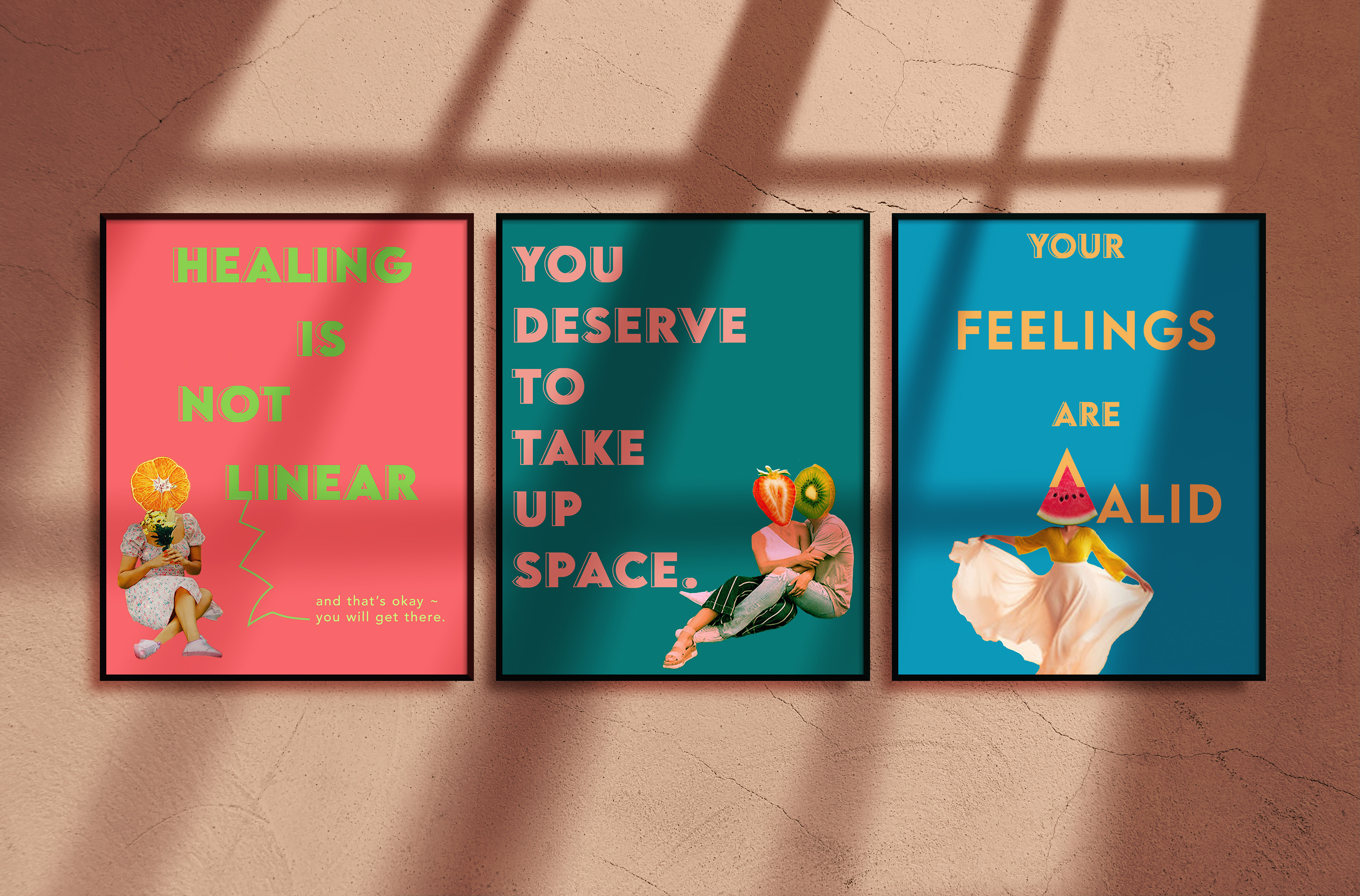
Choosing the Quotes and Designs
The quotes I chose are ones I have come across on varying social media platforms that resonated the most for me when I wasn't in the best mental space. I wanted to use a bright, spring coded color palette to signify the new beginnings that can take place once you dismantle the misassumptions that may come with what healing is supposed to look like. I loved creating the different fruit personas to compliment each poster; the fruits serve to represent the seeds of a new, healthy perspective taking place. I used the font LEMON MILK for its clean and bold read.
The Posters
"Healing is Not Linear," is my personal favorite quote. I used to think that healing meant that there were no more missteps or slip backs into old habits. But that is far from the truth; one slip up doesn't have to crush your hopes of things not getting better. Rather, they serve as an alarm to remind us we want things to be different and push us to continue to improve to be the best versions of ourselves. What matters is the reassurance that we will get there and still deserve our flowers for working towards this goal.

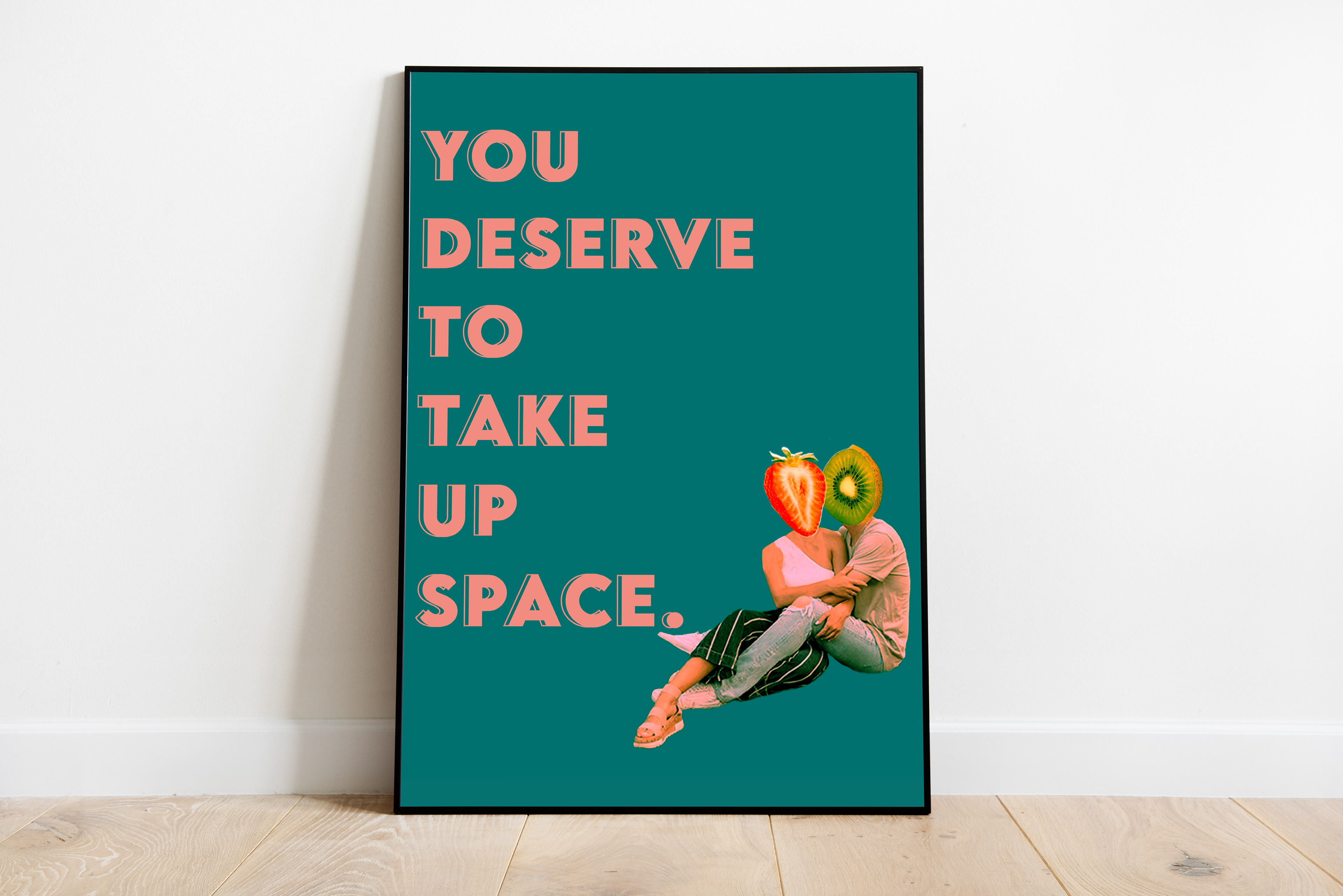
"You Deserve to Take Up Space": his particular poster in the series is singled out for being the only one with two fruit characters; I like the idea of the kiwi character comforting the strawberry character about taking up space, as in my experience it an intimate and lovely moment when it is another individual you love and trust reassuring you about your value to the world.
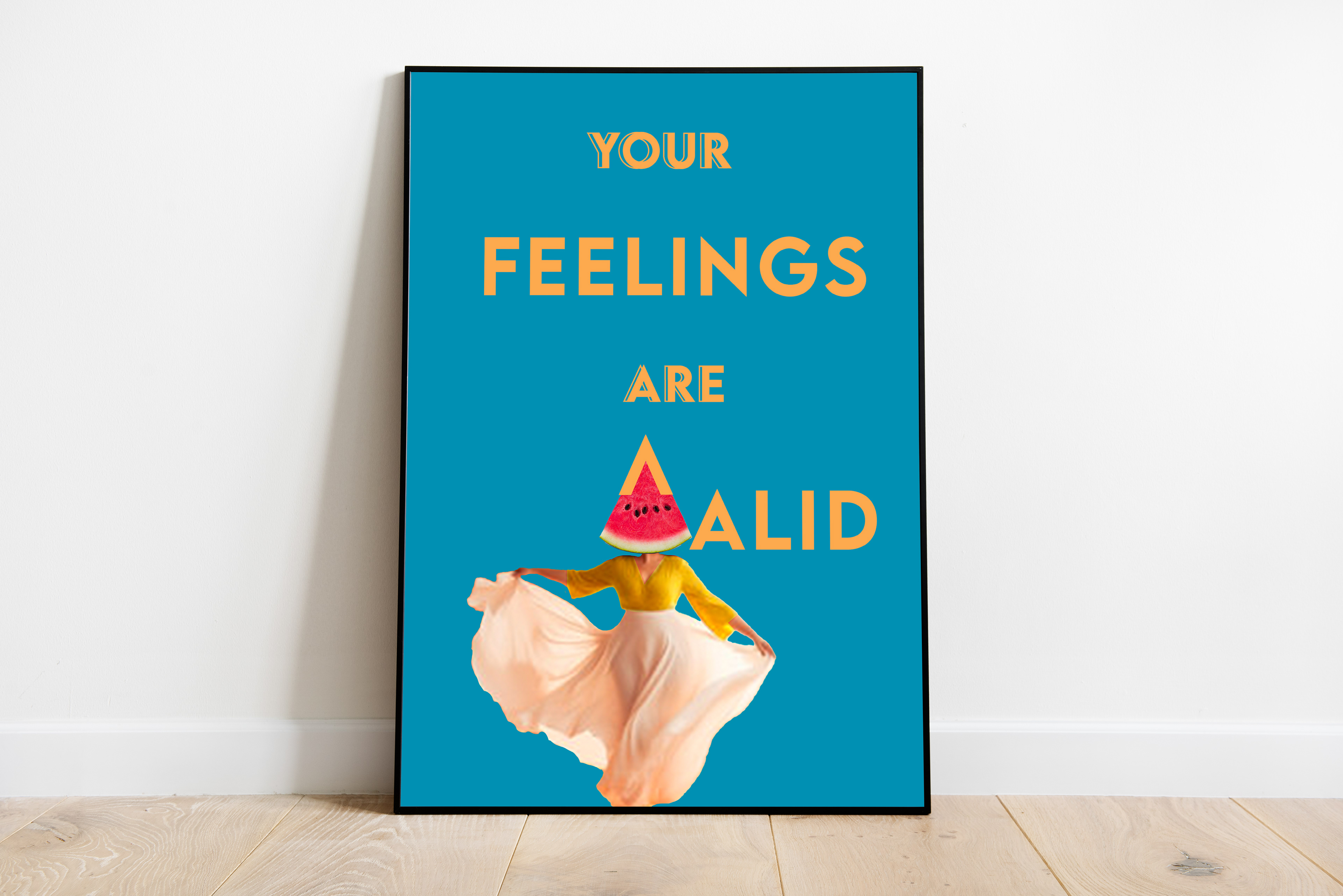
The watermelon waltzing into the assertion that "Your Feelings are Valid," is one of my favorite concepts in these posters, as the striking interaction of the imagery and text work together to push out this reminder.