Behind The Scenes
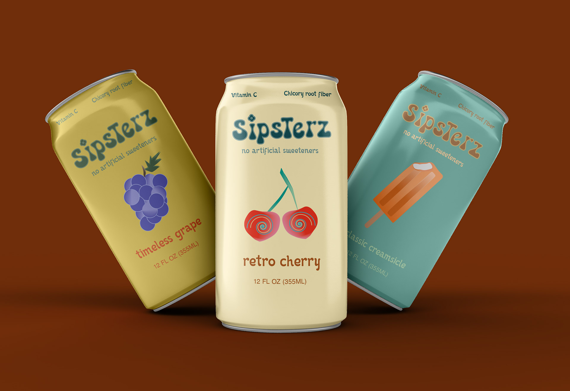
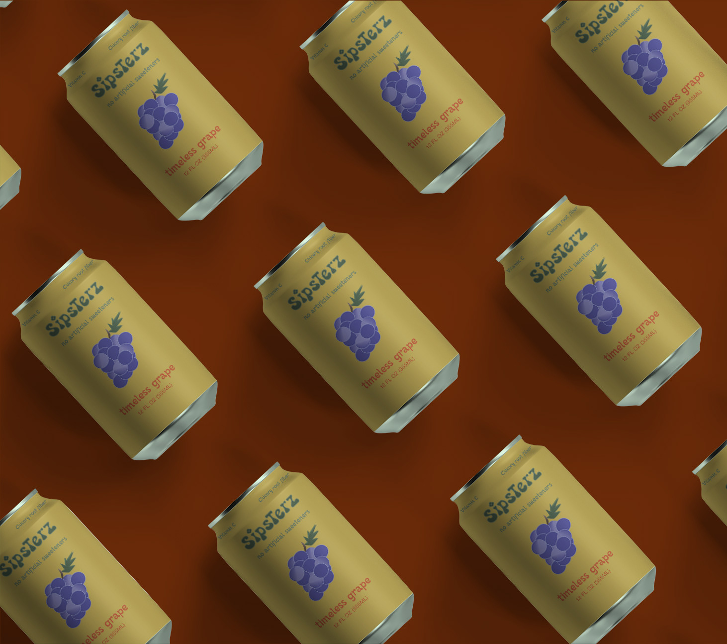
The biggest challenge was identifying a font that would reflect the retro/vintage concept of the product. As a result, approaching it with unconventional fonts felt necessary to achieve this look. I chose Retro Cool because the blotchy/thin line combo adds a fun touch to the brand name while still being legible. I paired this with Kind of Magic for subtext, since the loops mingling with the letters are playful. Sipsterz is meant to be ingested in a fun and laidback setting, and it felt important that fluid fonts would reflect that.
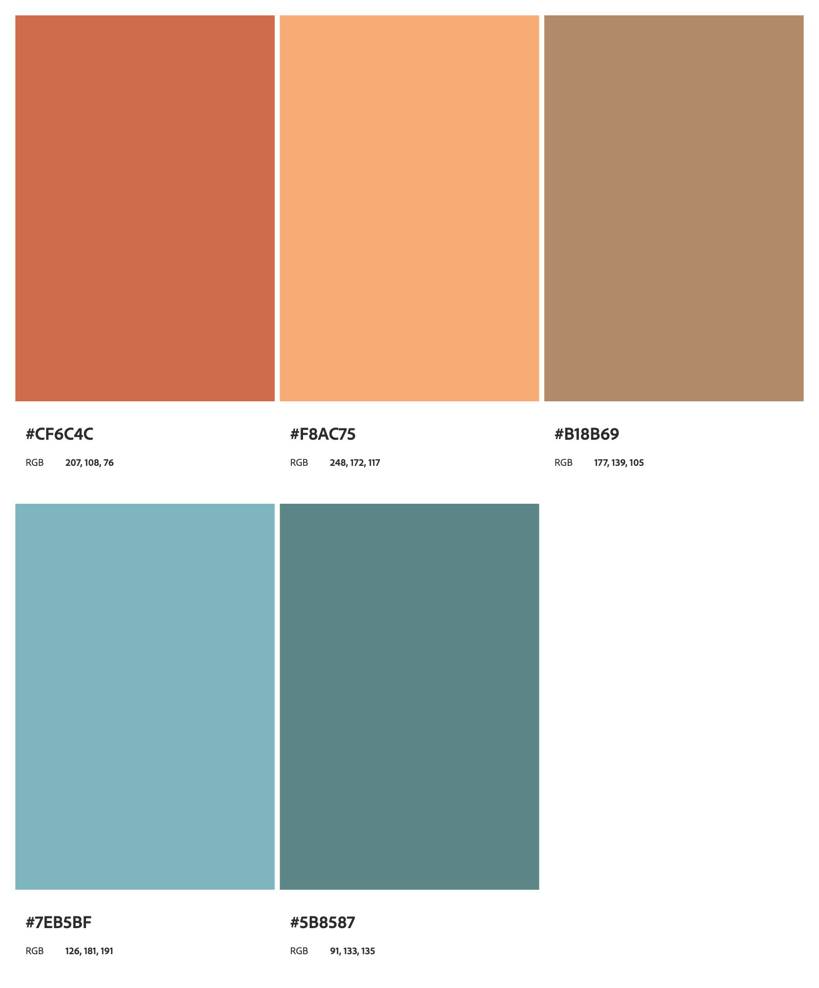
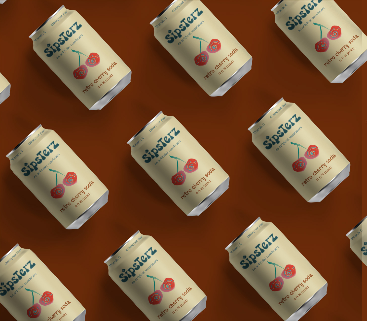
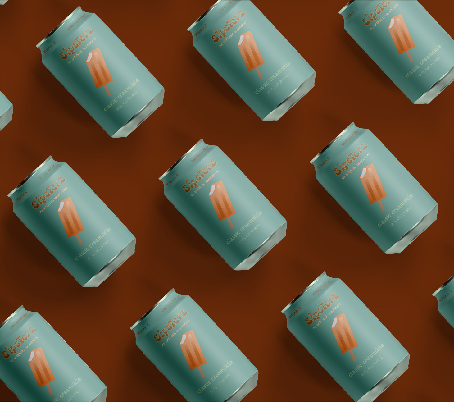
This being said, I contrasted the loose typefaces with a more muted color palette that contained pops of oranges, reds, and purples for the nostalgia aspect of the brand. I associate nostalgia with being a bittersweet, almost ruminating feeling of the past, which would be associated with the toned down colors, while also unveiling hope and provoking colors for the future. This project also gave me the opportunity to illustrate dimensional fruit vector images that paired best with punchy keywords that are reminiscent of the past, such as "timeless," "retro," and "classic."


Biggest Takeaway
My biggest takeaway from this project was the significance in story-telling when it comes to products. The things we consume coexist with the environment we consume them in, and this equates to how positive our memory of that experience will be. By having a product design as enjoyable as its taste, we hope for Sipsterz to instill nothing but good memories in a customer's mind. As an individual who values looking back at positive memories, I draw from my own experiences of what a refreshing beverage can bring back to mind.